
[TIMELINE]
JUN - SEP, 2022
[ROLE]
PRODUCT STRATEGY, RESEARCH, UI/UX
[TEAM]
PM MARI MALCOLM
PROVIDER TEAM, SALE TEAM, ADS TEAM, FE&BE TEAM
Optimized the crucial doctor profile pages to improve user decisions, boost provider visibility, and drive revenue.
Context
RealSelf, the leading platform for cosmetic treatment decisions, connects millions of users with doctors through comprehensive information, reviews, and ratings. Doctor profiles are the critical final step in this journey, serving as both a trusted resource for patients evaluating doctors and a key sales tool for doctors acquiring new patients. This project focuses on optimizing these crucial profile pages to improve user decision-making, boost provider visibility, and drive revenue growth.


Why Provider Profile Matters
#1 Streamlined Efficiency
Automates and streamlines complex travel booking processes, freeing up time for event organizers and TMCs.
#2 Elevated User Experience
Simplifies travel management for both event organizers and attendees, providing an intuitive and user-friendly interface.
#3 Industry-Wide Adoption
The release of Events led to significant client acquisition, with major companies like Meta, Amazon, and Walmart adopting the platform for their group travel needs.
Challenge
#1 Low Engagement
Booking CTR ↓
Negative feedback - information scattered; disorganized information hierarchy
#2 Underrepresented Core Competitiveness
Insufficiently showcased our extensive network of professional medical information.
Goal
Assist users in making informed decisions.
Boost the appeal and profitability of our providers.
Increase consultation bookings, driving revenue growth.
Process
1/ I explored the problem space by conducting stakeholder interviews across B2B and B2C teams to identify existing pain points and past learnings, while also assessing technical complexities to inform the design MVP and uncover opportunities.

2/ Collaborating with the BI team, I analyzed site metrics and established weekly meetings to discuss questions and plan MVP testing. Key findings revealed the strong influence of recent reviews on user contacts, the importance of specialties modules for decision-making, and the critical role of Before & After photo quantity in building trust. Consequently, the design will emphasize review post dates, doctor expertise, and photo count.

3/ To validate assumptions and uncover further opportunities, I conducted a ten-user usability study and led a stakeholder workshop (PMs, sales managers, and VPs) to share findings and brainstorm solutions.

4/ Based on these insights, I developed a two-pronged design strategy: enhancing content browsing and revamping the page structure for improved information architecture. Despite technical constraints and the need for cross-departmental collaboration, we will incrementally implement key design updates in future React migrations.

Design
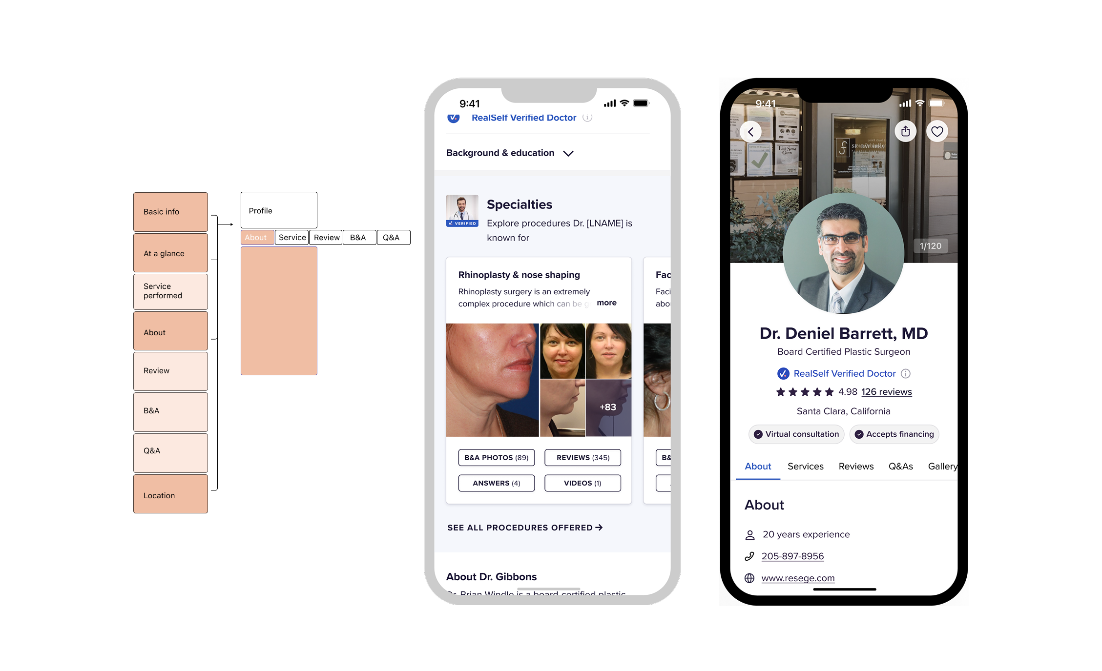

Streamlined Reviews: To facilitate efficient decision-making, I prioritized key review attributes, including prominent rating scores, clear post dates, and a quick review feature.
Enhanced Q&A: I improved the Q&A section by highlighting treatment keywords for better organization, using image counts in cards to address media upload concerns, and prioritizing questioner information for user relevance.
To enhance the user experience, I replaced the endless-scroll layout with an intuitive tabbed navigation system. This streamlined approach improves content discoverability, simplifies browsing for first-time users, and aligns with existing navigation patterns across the platform, ensuring consistency and efficiency in development and maintenance.
To enhance trust and clarity, I added a verified icon to the doctor's sticky bio and provided clear back-navigation. A strategically placed "book consultation" call-to-action increased the click-through rate from 45% to 65%. While time on page slightly decreased, the improved CTR indicates higher user engagement and a positive response to the new design. This success reinforces the effectiveness of the new layout and supports its implementation across other core pages.
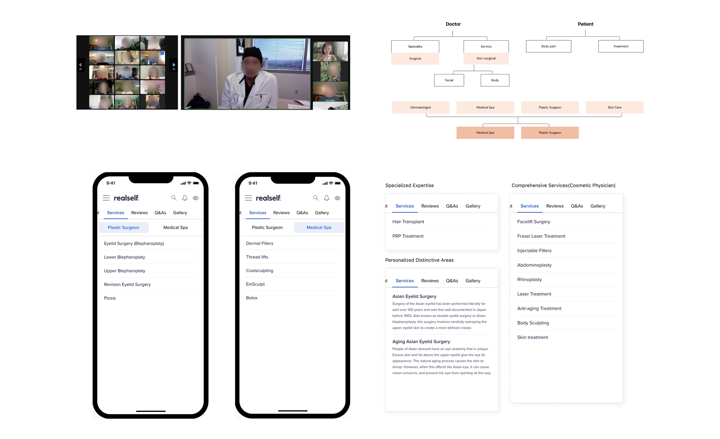
To improve how users explore doctor specialties, I redesigned the "Specialties" section. Previously, a horizontal carousel limited content visibility and complex navigation caused user confusion. The new streamlined layout prioritizes clarity and ease of use, ensuring users can quickly find the information they need. This involved understanding how users, often without medical backgrounds, search for treatments. Collaborating with a UX writer, we recategorized services based on user needs and terminology, moving away from medical jargon and towards a more patient-centric approach.
Revamped Gallery: The photo gallery now features categorized, doctor-generated photos in a waterfall-style layout, allowing for easy comparison and more engaging visuals.

